To achieve a refined yet rustic aesthetic with warm tones, homeowners should select colors like Sherwin-Williams Latte or Benjamin Moore Rainy Afternoon. Using natural materials such as reclaimed wood and warm grays like Warm Stone creates a balanced look. Pair these with soft whites for a fresh backdrop. Opt for accents in deep hues and warm metallics to enhance sophistication without yellowing. This design strategy invites comfort and elegance into any space. Further insights reveal more effective applications.
Key Takeaways
- Opt for warm neutrals like Sherwin-Williams Latte and Warm Stone to create a refined look without yellow undertones.
- Incorporate deep accents such as Behr Cracked Pepper to enhance the sophistication of warm palettes.
- Mix reclaimed wood and stone textures with warm earth tones for a rustic yet refined atmosphere.
- Use soft whites and warm grays to achieve balance and prevent dated aesthetics in your design.
- Choose fabrics in earthy shades to enrich the welcoming essence of sunlit spaces without compromising elegance.
The Essence of Warm Tones in Home Design
The essence of warm tones in home design lies in their ability to create a cozy and inviting atmosphere, essential for fostering comfort within a living space. These shades, often encompassing neutral tones and muted earth tones, evoke feelings of groundedness and serenity. A rustic palette featuring warm tones, such as taupe and brown, combines beautifully with textured materials to add physical depth and visual interest. To enhance the sophistication of these colors, strategic lighting choices, like warm incandescent or LED bulbs, can enrich the hues without introducing excessive yellowing. Additionally, integrating accents in rich hues, such as deep greens or smoky violets, provides balance, ensuring that the warm tones contribute positively to the overall aesthetic without overwhelming the design. Incorporating elements like brushed nickel finishes can further elevate the style of the space, complementing warm tones with a touch of elegance and versatility.
Color Selections That Embrace Warmth Without Yellowing

Selecting colors that enhance warmth in a room while avoiding yellowing can greatly influence the overall atmosphere. Warm tones can be successfully achieved with neutral shades like Sherwin-Williams Latte, a creamy beige-brown that softens spaces. Incorporating rich earthy tones, such as Sherwin-Williams Warm Stone, introduces depth without veering into yellow territory. Additionally, embracing muted greens like Benjamin Moore Rainy Afternoon can bring a fresh, calming quality to interiors. To add texture and sophistication, dark accent colors like Behr Cracked Pepper perfectly complement these selections. For fixtures and decor, incorporating warm metallics alongside a crisp white backdrop can elevate the design, ensuring a balanced, inviting ambiance that remains free from unwanted yellow hues. When choosing lighting for such spaces, consider dimmable functionalities to control the intensity and create the desired atmosphere.
Recommended Products

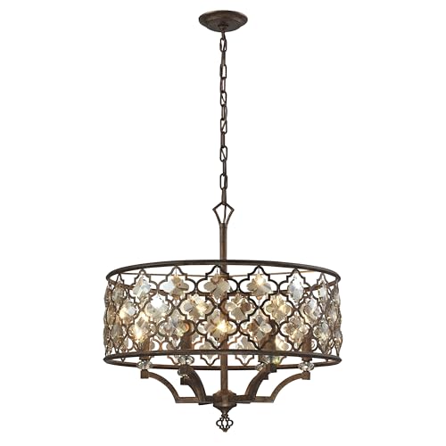
Modern Staircase Chandelier: Elevate entryways with this gold high-ceiling chandelier; featuring (49 Droplets) and a 128-inch adjustable design, it creates a striking focal point for staircases, foyers, and open spaces

Medieval-Style Vintage Chandelier: Transform your space to a classic, timleless haven with the Noble Candle Chandelier. Its antique, European design adds a touch of rustic sophistication to any room
Product Dimensions: 35" Width x 12" Depth x 18" Height
Blending Natural Materials With Warm Hues

Incorporating natural materials into interior design effectively enhances warmth while promoting a cohesive aesthetic with warm hues. Utilizing reclaimed wood and stone creates inviting atmospheres, enriching spaces with natural textures. Choosing warm earth tones, like deep browns and soft taupes, avoids yellow undertones while instilling a cozy aesthetic. Pairing these materials with rich colors, such as deep green or muted blue, introduces contrast that emphasizes warmth, steering clear of yellowing. In addition, the inclusion of warm metals like bronze and copper alongside wooden accents amplifies allure without detracting from the intended warmth. Finally, selecting fabrics in warm, earthy shades, such as linen or wool, guarantees a welcoming atmosphere, particularly in sunlit areas, by enhancing the overall design without introducing unwanted hues. Frosted glass shades effectively diffuse light, reducing shadows within a space and contributing to a cozy environment.
Recommended Products

Materials: Reclaimed pine wood


Design - From the Bedford Country Cottage Collection by Martha Stewart, this stunning classic scoop chair has soft linen color velvet upholstery with brass nailhead trim along the silhouette, solid wood legs in reclaimed wheat finish. This makes a nice dining chair or accent chair for your home decor
Creating Balance With Soft Whites and Warm Grays
Creating a harmonious space often requires an expert balance of colors, particularly when combining warm tones with soft whites and warm grays. Soft whites, such as Benjamin Moore’s Cloud White, serve as a serene backdrop, allowing warm tones to shine while avoiding a yellowed appearance. Incorporating warm grays like Sherwin-Williams Warm Stone grounds these tones, creating a balanced aesthetic that adds depth. A mix of soft whites and warm grays guarantees a cohesive color palette, preventing spaces from feeling dated. Light, creamy whites act as highlights against deeper warm colors, fostering an inviting atmosphere. The subtle visual contrast between these shades enhances textures and architectural elements, evoking a refined rustic charm that captivates and provides warmth without overwhelming the senses. Including adjustable picture lights in your decor can further enhance your artwork by highlighting textures and colors, creating a visually appealing focal point in the room.
Recommended Products

COMPACT AND ADJUSTABLE PLUG-IN ART LIGHTING: Experience the convenience of compact, adjustable LED art lights available in three color temperatures — Color Tuning 2700K - 4000K, and fixed 2700K or 3000K (see other listing). The slim, 3/8” bar style light can be easily turned on and adjusted with the included remote control (programmable to multiple lights) that offers over adjustable brightness of the 95+ CRI light, auto-on and shutoff timers, color tuning options, as well as manual on/off buttons.

Sophisticated Source of Versatile Lighting: Blending Modern and Traditional styling, this Heritage Brass art light fully pivots to achieve the optimal angle of light

Compact Plug-in LED Picture Light For Various Sizes of Artwork (See Above) | This is NOT a Wireless Product | For Wireless Products See Our Rechargeable Touch Series and Rechargeable Micro Series | Discreet, Slim Bar Style Design | Available In Brushed Brass, Antique Bronze, Black, or Silver | Available in 2,700K, 3,000K or Color Tuning from 2700K - 4000K | Designed and Made in America
Effective Applications of Warm Tones in Different Spaces
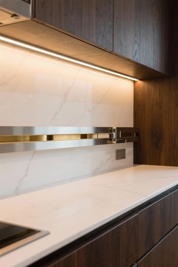
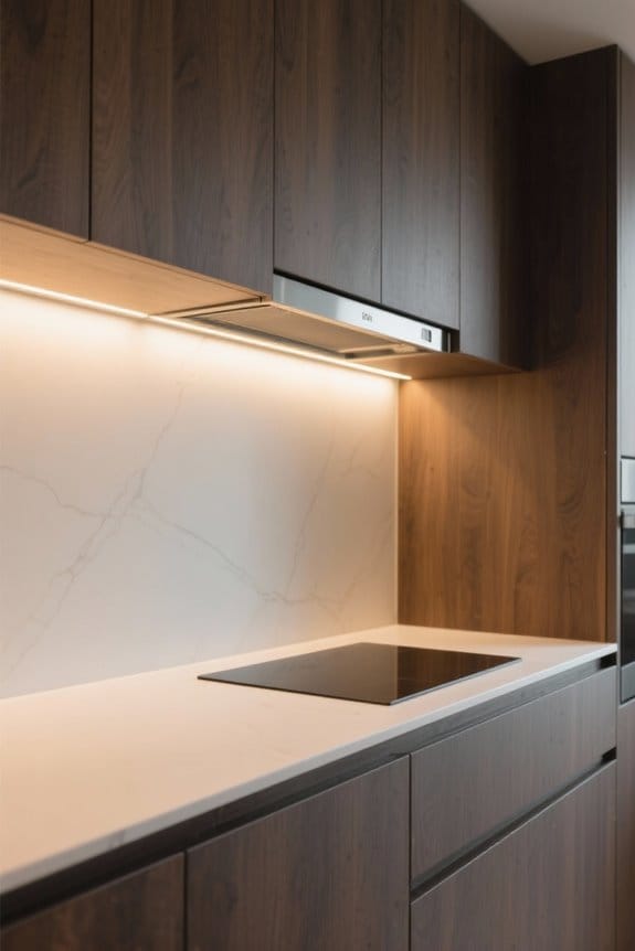
How can warm tones transform various spaces within a home? In living areas, warm earthy tones, such as Sherwin-Williams Latte SW-6108, offer inviting warmth when paired with cool neutrals, fostering a cozy ambiance. Bedrooms benefit from shades like Benjamin Moore Shelburne Buff HC-28, creating a fresh, inviting atmosphere while avoiding dated looks. In kitchens, applying Behr Hazelnut Cream 750C-2 enhances rustic charm and highlights natural wood accents, making the space feel welcoming. Dining rooms can incorporate sophisticated accent colors, like Behr Peruvian Violet 660F-6, to elevate decor without introducing yellowish hues. In corridors, warm grays, such as Sherwin-Williams Warm Stone SW-7032, provide balance, ensuring an inviting atmosphere that complements a modern rustic color palette. Additionally, incorporating energy-efficient LED options in conjunction with warm tones can enhance ambiance while significantly reducing energy costs.
Recommended Products
Product Dimensions: 24" Width x 24" Depth x 24" Height

Perfect for Your Kitchen Island – Classic Swivel Seating – The Maven Lane Pullman Counter Stools (Set of 4) offer a perfect blend of comfort, style, and functionality, beautifully finished with finely upholstered seats, classic nailhead trim, and smooth 180 degree swivels, making them an ideal seating choice for everyday dining or casual gatherings

【Easy Installation】At least 1/2" bigger than measured opening to allow doors to open. 60x36 Inch Surface Wall Mounted medicine cabinets for bathroom is easy to install and operate with User instructions, which are wrapped with a strengthened package carefully to better protect the cabinet body. (Only support Hard wired)If there is any damage to the lights or doors during use, please don't worry, we can provide free replacement doors. For any doubts and questions, please feel free to contact us via Amazon email.
Tips for Achieving a Cohesive Rustic-Refined Aesthetic
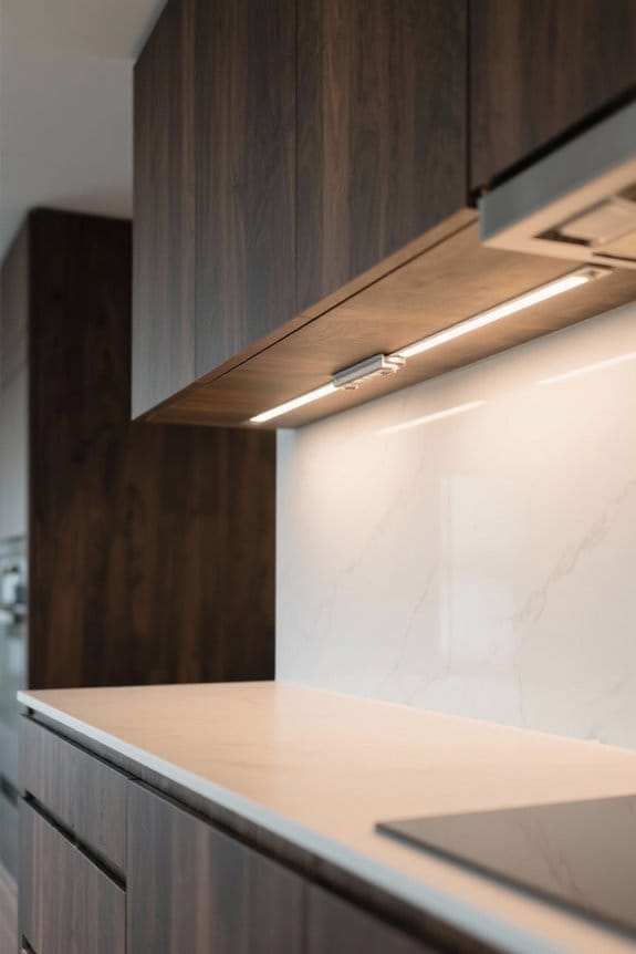
Achieving a cohesive rustic-refined aesthetic involves a thoughtful blend of warm neutrals, earthy tones, and layered textures that enhance any space. Begin with neutral shades like Sherwin-Williams Warm Stone or Behr Hazelnut Cream, which enrich without unwanted yellow undertones. Integrate rich browns and greys to harmonize with rustic features like wood and stone, creating visual unity. Utilize accent colors, such as Behr Peruvian Violet or Sequoia Dusk, to introduce depth and contrast while maintaining a cohesive palette. Focus on layering textures and materials, incorporating soft fabrics and natural elements to enhance warmth. Finally, test paint samples in various lighting conditions to guarantee colors maintain their intended balance, essential for achieving a refined aesthetic. Consider incorporating under cabinet lights to enhance ambiance and functionality in living spaces, adding both style and practicality.
Recommended Products

【185 Cans + 77 Bottles – Space for Everyone】This 24-inch cooler fits standard kitchen cabinetry—so it can be built in for a seamless look or used freestanding wherever you need it. Inside, it holds 77 wine bottles up top for your personal collection, plus 185 beverage cans below for the whole household. No more fighting for fridge space—everyone's drinks have their own place.
Set Includes: 2x Multi-Use Lockers, 1x Rolling Tool Drawer Cabinets, 2x Two-Door Base Cabinets, 3x Wall Cabinets, 1x 72" Bamboo Worktops and 1x 72" Backsplash Kits

[Modern-Style Design] The 3-stack stainless steel range hoods are available in 5 colors (Brushed Stainless Steel, Black, White, Matte Gold, Copper) and are suitable for most kitchens or condos. The dimension is 30"W/36"W x 30"H x 14"D for wall mount installation, with a recommended height of 28" to 30" above your cooktop
Frequently Asked Questions
What Color Makes a Room Feel Warmer?
Earthy shades combined with cozy neutrals create a warm atmosphere. Warm color palettes, vibrant accents, and layered tones enhance comfort, while warm lighting, texture play, and natural materials establish harmonious contrasts, influencing room perception through color psychology.
What Colors Are Used in Rustic Style?
What colors evoke the essence of rustic style? Earthy palettes abound, featuring muted greens, terracotta tones, deep burgundy, and soft browns, harmonizing beautifully with wood accents, vintage furnishings, cozy textiles, and natural materials.
What Color Is Replacing Gray in 2026?
In 2026, warm neutrals and earthy tones are expected to replace gray in interior design. These muted colors, paired with vibrant accents and soft pastels, resonate with color psychology, fostering grounding and inviting natural palettes.
How to Soften a Yellow Room?
“Too much of a good thing can be wonderful.” To soften a yellow room, consider warm shades palette, cream vs beige textiles, soft lighting techniques, texture and warmth, and balancing colors through decor accents and wall art choices.